13 EMILY L MESSINA ET AL

Are conference presentations accessible? Insights from an online survey to improve equity

  • FEATURED RESOURCES

    Note: use pinch and zoom to view images on mobile devices

    Are conference presentations accessible? An overview by Emily L Messina
  • KEY TAKEAWAYS

    Note: use pinch and zoom to view images on mobile devices

    Conference attendees with accessibility needs want:


    • Online access
    • Uncluttered posters 
    • Slides with mixed text/images
  • BACKGROUND

    Note: use pinch and zoom to view images on mobile devices

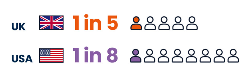
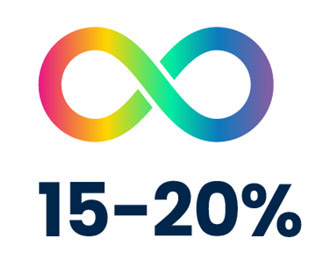
    Many conference attendees need greater access1

    Identify as disabled:2

    The flag for the United Kingdom (UK) is shown next to five people icons. One icon is filled in orange. One in five people in the UK identify as disabled. The flag for the United States of America (USA) is shown next to 8 people icons. One icon is filled in purple. One in eight people in the US identify as disabled.

    Are neurodivergent:3

    A rainbow-colored infinity symbol. Fifteen to twenty percent of people are neurodivergent.
  • METHOD

    Note: use pinch and zoom to view images on mobile devices

    We distributed an online survey to assess general, neurodivergent, D/deaf, and disabled conference attendees:


    • Accessibility needs
    • Preferred presentation formats
    • Recommended improvements
  • SURVEY POPULATION

    Note: use pinch and zoom to view images on mobile devices

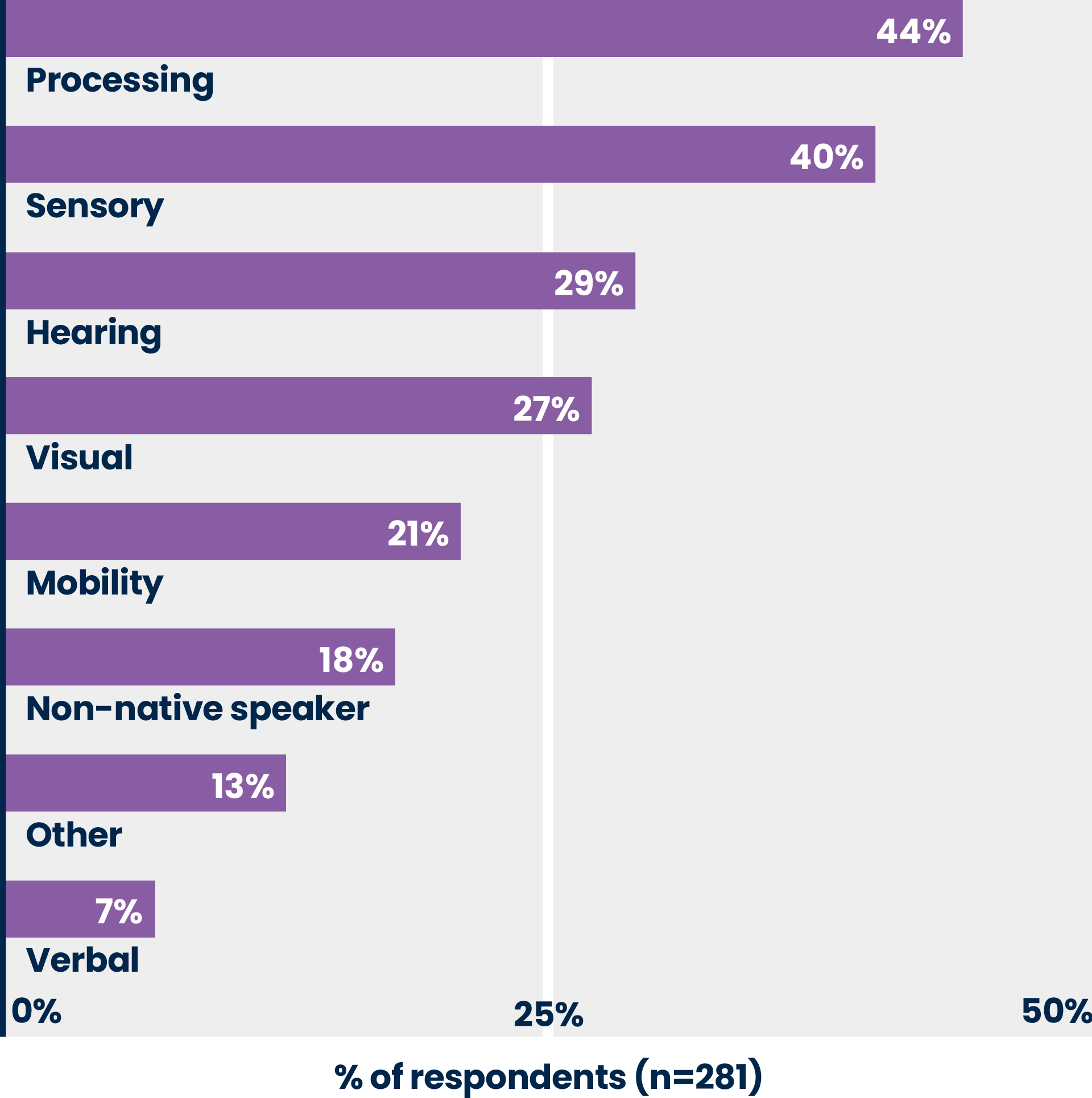
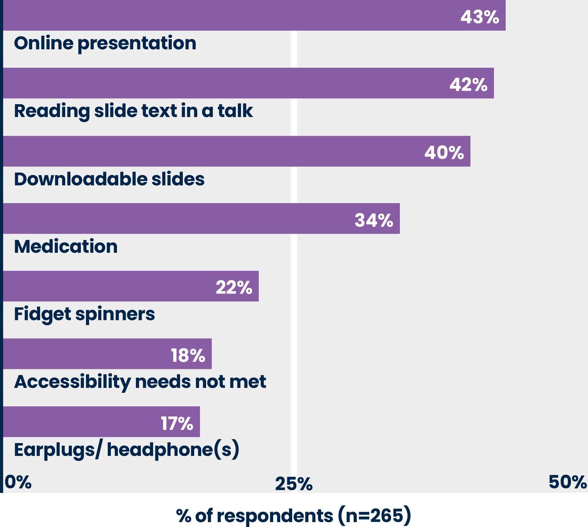
    Of 493 total respondents, 57% of conference attendees reported 1 or more accessibility need and 18% reported their needs were unmet

    Reported accessibility needs/disabilities


    A bar graph with the percentage of respondents (n=281) is on the X-axis and categories of accessibility needs or disabilities are on the Y-axis presented in descending prevalence: processing, 44%; sensory, 40%; hearing, 29%; visual, 27%; mobility, 21%; non-native speaker, 18%; other, 13%; verbal, 7%.


    Top reported management strategies/tools
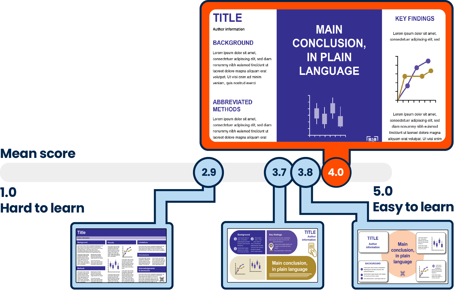
    A bar with the percentage of respondents (n=265) is on the X-axis and categories of management strategies and tools are on the Y-axis in descending prevalence: online presentation, 43%; reading slide text in a talk, 42%; downloadable slides, 40%; medications, 34%; fidget spinners/stimming devices, 22%; accessibility needs are not currently met, 18%; ear plugs/headphones, 17%.

  • POSTER FORMATS

    Note: use pinch and zoom to view images on mobile devices

    Respondents favored designs featuring less visual clutter
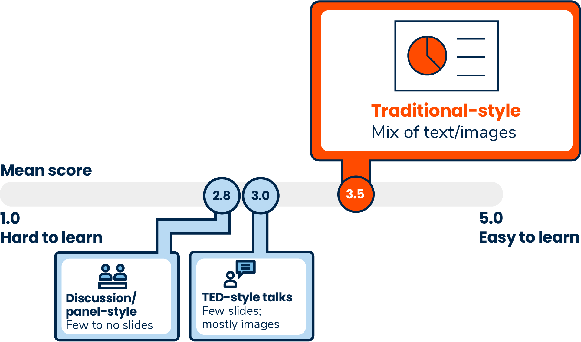

    Four icons showing posters in different formats. Each format was rated by respondents based on how easy it was to learn. A slider bar showing the mean rating on a scale of 1 (hard) to 5 (easy). There are four poster icons representing different formats. The first represents a traditional scientific format with dense text and a few images; rated the lowest, 2.9. The second represents an infographic-style poster with less text and more color usage; rated a 3.7. The third represents an infographic-style poster with the conclusion in the center, with graphs and text placed around it; rated 3.8. The fourth represents the #betterposter layout, with a large central area for the main conclusion and a graph with additional text and graphs placed to the sides; rated the highest, 4.0.

  • TALK FORMATS

    Note: use pinch and zoom to view images on mobile devices

    Respondents favored traditional style over TED-style talks and panels


    Three styles of talks were rated by respondents based on how easy it was to learn on a scale bar of 1 (hard) to 5 (easy). Talk icons appear from left to right, representing formats rated as hardest to learn to easiest to learn. The first represents discussion or panel-style talks (with few to no slides); rated 2.8. The second represents TED-style talks (few slides; mostly images); rated 3.0. The third represents traditional style talks (mix of text and images); rated 3.5.

  • QUOTES FROM RESPONDENTS

    Note: use pinch and zoom to view images on mobile devices

    "For the love of god have enough chairs, and let people sit down to look at posters"

    "Include enough text so people with different languages can follow along"

    "Almost accurate [captions] is no good. Something that looks like access but isn’t access is worse, because now nobody feels bad about the lack of access. In fact, they’re kind of proud of what they did. However, it is garbage and not actual access, and they’re angry with my lack of appreciation"
  • ADDITIONAL RESOURCES

    Note: use pinch and zoom to view images on mobile devices

    Here is a list of additional resources related to this poster that you may find useful.

AUTHORS

Emily L Messina, Zen Faulkes, Noofa Hannan, Mike Morrison, Anja Petersen, Heather Robertson, Lauren C Strother, James L Wells

Messina: CMC Affinity, IPG Health Medical Communications, Faulkes: McMaster University, Hannan: Caudex, IPG Health Medical Communications, Morrison: Curvenote, Petersen: Complete HealthVizion, IPG Health Medical Communications, Roberston: IPG Health Medical Communications, Strother: CMC Connect, IPG Health Medical Communications, Wells: CMC Connect, IPG Health Medical Communications

Presented at the 19th Annual Meeting of ISMPP, April 24-26, 2023. Washington, DC


  1. Sousa BJ & Clark AM. 2019. Int J Qual Methods. 18: 160940691986237
  2. Sarju PJ. 2021. Chem. Eur. J. 27, 10489–10494
  3. NIH. 2022. https://dceg.cancer.gov/about/diversity-inclusion/inclusivity-minute/2022/neurodiversity